skip to main |
skip to sidebar
Well it's that time of year again when it's time to enter the DSWF Wildlife Artist of the Year competition. I seem to always enter the 'endangered species' category, probably because unfortunately the most beautiful animals on this planet are now threatened with extinction. The Hyacinth Macaw is a perfect example. A truly stunning bird, it has been on the IUCN Red List as endangered since the year 2000, due to the destruction of it's habitat and being captured for the pet trade.
So as such I thought it would be the perfect subject to paint for this year's competition. The most difficult challenge was recreating that vivid blue plumage. I used a mix of Ultramarine, Cobalt Blue and Intense Blue. I wanted a bit of contrast against the blue, so I added some purple as a highlight, and Paynes Grey as a shadow. I kept the feather detail to a minimum as I wanted the colours to merge and run into each other, to create texture and pattern.
Let's keep fingers crossed that the judges like this painting enough to include it in this year's exhibition!
It seems fitting for me to begin 2013 with a new blog post, which admittedly has been a long time coming! I must admit I have been quite lax with my art in recent months, but I aim to be much more prolific this year.
This piece is a Christmas present commission that I painted in early December. Dogs are a subject I rarely paint, but after this I think they are something I should tackle more often! This Gordon Setter proved to be a beautiful subject for watercolour. The rich blues, blacks and golds in the fur are a striking combination when blended together, and the fluffy fur was fun to paint with my messy, splatty brushstrokes.I think it actually looks like she has just emerged from a good swim in a pond!
What I feel is most successful, is that there is a lot of 'life' in the face of the setter. With any animal I always put a lot of time into getting the eyes right, which gives the piece a great sense of character.
It has been quite a while since I last picked up a paintbrush. I don't have any excuses, I suppose I have just had a 'block' of some sort!
However, as I comeback I wanted to attempt a subject I haven't tried before.
Any young animal is a challenge, and I thought a great subject would be a puppy. This is 'Tala', my parents' new German Shepherd. I kept the paint application very loose, working on very wet paper, allowing the colours to bleed into one another. I later added darker patches onto the still wet paper, to add shadow and tone, adding extra water where I wanted lighter fur areas. The finishing touch was some smaller splashes and flicks of thicker paint to highlight her fluffiness. The most difficult part of her to paint were her eyes. I added bright highlights of white to make them shine, then wet the paint around the pupils and lifted it with some tissue to further highlight the colour of the irises. I don't normally work this loosely, but I think I will try and do it more in the future as I am very pleased with the effects.
In other news I have submitted 3 paintings to the 2012 National Exhibition of Wildlife Art. Fingers and toes crossed that they shortlist at least one of my paintings!
 Believe it or not, tigers like nothing better than to cool off in lakes and streams, and will even hunt in water. The most famous tigers to display this behaviour are those in Ranthambore National Park, India
.
As tigers are incredibly threatened at the moment, I thought they would make the perfect subject for this years DSWF wildlife art competition.
This is actually my second attempt at this image. I did not anticipate how hard the reflections could be - they can very easily turn into a big watery and muddy mess! I kept them very simple, by wetting the shape of the reflection area, then adding loose blobs of either red, orange or blue/black. Once the area had almost dried, I added the surrounding water, letting some areas run into the reflection.
I put the most detail into the tiger's head. I used layers of fine 'brush splatters' to create a furry appearance, more so on the longer fur under the ears.
I have kept the background neutral, as this means the main focus is on the tiger and the water. Foliage or riverbank could easily make the image muddy and dull.
After some reassurance, I am now happy with this watercolour, and will enter it in the 'Endangered' category, along with the Red Breasted Geese. Wish me luck!
 I will be completely honest and say this painting was a pain in the backside to do! Usually my subjects are quite static, so this time I wanted to add a bit of action, and have the duck rising out of the water and stretching it's wings. I watched 2 Eider Ducks bathing in the late afternoon light at the WWT wetland centre, so had plenty of reference, but I just could not get the wings correct. I spent ages sketching out the lines in pencil, and even when I applied the paint the right wing looked pinioned and at an incorrect angle.
Even so, I perserveared and eventually produced an image I am fairly happy with. What I enjoy the most about this image is the water. Splashing the page roughly with blue and black ink created some great movement, and the colours on the bird are soft and warm.My next aim is to produce something for the David Shepherd Wildlife Artist competition. A Tiger will be the best subject for the Endangered category methinks.
 On Saturday my mum and I visited the WWT reserve in Barnes, West London. It was a beautiful sunny day, and perfect for watching all the lovely wildlife there. My favourite wildfowl there were the Eider Ducks, and these colourful Red-Breasted Geese. They were lit up by the late afternoon sun, and just crying out to be painted!This was quite an ambitious image for me to paint in watercolour. Water is one of the trickiest things to paint, especially when coupled with reflections. I took inspiration from Lars Johnson's watercolours of wildfowl. He uses simple loose brushstrokes on wet washes to produce a loose impression of the bird in the water. He also uses the white of the paper to illuminate the subject. I have a habit of covering even the white parts of my subjects with colour, so I wanted to try this method instead. I am quite pleased with this image as it is my first painting since the summer!
The red, black and white of these birds make a lovely contrast, and I will probably re-visit them again to paint, but first I am going to try some Eiders.
 Whilst visiting Wiltshire with my boyfriend last weekend, we walked past a farm and saw this weird but wonderful cockerel. This breed of chicken is called a 'Poland'. It's most eye-catching feature is the fantastic hairdo, which reminds me of David Bowie's character Jareth from the film Labyrinth (if you haven't seen this film already, watch it, it's amazing!).
Unfortunately the feathers over his eyes seemed to completely obscure his vision. Every time the wind blew and the leaves rustled, it ran around erratically not knowing what on earth was going on! However, I just had to paint him. I had to paint him in sections, otherwise the different reds and browns would have blended into each other. Looking at this painting has made me realise that I really need to do something with my backgrounds. I need to introduce more colour around the subject, instead of just a small area at it's feet. I think this will have to be my project going forward.
 These are my first attempts at some new landscapes, inspired by my recent holiday to County Kerry in Ireland. The first is a view of the mountains overlooking Dingle Bay on the Dingle Peninsula. I am not quite as confident using watercolour for landscape painting, as it is very different compared to painting wildlife. I kept the image 'loose'
,
using a wet on wet technique. I wanted the mountains to blend into the sky, to give the effect of clouds drifting over the mountain tops, so I added the mountains whilst the sky was still moist. For my first watercolour landscape in several years,
 I am fairly happy with the result. It is very atmospheric and moody.
The second painting to the left are the mountains overlooking Muckross Lake in Killarney National Park. I painted this using my usual method in acrylic, using a palette knife to apply the majority of the colour. I only used a paintbrush to give the softer cloud effects, and to blend the reflections. I prefer to paint in this method, as it is far more expressive. Although, as my stepdad pointed out, I need to paint on canvas paper or board, so the acrylic flows better and does not create such harsh lines. This calls for a trip to the art shop to stock up tomorrow!
 Working in a school means that I luckily get some time off over the summer holiday period. I am using this time to get back into the swing of painting.
Today I focused on this small study of a Welsummer cockerel and hens. As it is a small study, I wanted to be be as loose as possible with my style. This is easier said than done! I couldn't help adding the little details such as the little grass stems and feather flecks.
What I like about this painting is that I have captured the 'action'. Cockerels are very attentive of their ladies. If they find a titbit on the ground, they will cluck excitedly. The hens will run over and grab the food, and the cockerel will sidle up to them, asserting his dominance.
Welsummers are my favourite chickens to paint. Their colouring is stunning, and a wonderful challenge for watercolours.

 I recently bought a Windsor and Newton travel watercolour set in preparation for a holiday to Ireland. Before leaving, I decided to try them out by adding some colour to these two sketches. The first is a red-tailed Bumble Bee on a pink Cosmos flower. I have filled my garden with these wildlife friendly plants, and the bees and hoverflies cannot get enough of them! They make interesting subjects to draw from life. Even with a limited colour palette, I am pleased with the vibrancy of the pinks, reds and purples in this image.
The second sketch is of a chicken with attitude, called 'Nora Batty'. She was the boss of the chicken coop, hen pecking all the other poor girls. I think the best thing about this watercolour is the stance of the hen. I have been observing and drawing chickens since I was a child, and it has given me the ability to capture their characters, and the details of their feathering.
Overall I am impressed with the quality and colour range in my travel set, and I aim to use it a lot more out in the field. I look forward to using it to paint some Irish landscapes.
 I submitted three images this year to the National Exhibition of Wildlife Art. This image to the left is the sole image to have made it through to the final exhibition. I am quite surprised, as I thought the other 2 paintings I submitted were a lot stronger!I am now hoping that someone likes this little dude enough to buy him and take him home.
The painting can be viewed on the exhibition website at http://www.newa-uk.com/pages/home.php, and is on display at the Gordale Garden Centre, Chester High Road, Burton, Wirral, CH64 8TF.
Be sure to have a look at both my parents (Paul and Catherine Apps) paintings as well, as they have also made it through to the exhibition.
 The last time I painted a landscape was in my third year of university, which was well over four years ago! I wanted to paint something special for my mum's birthday card, and what better than the old farmhouse that my family and I lived in during the early 90's. This is a beautiful house overlooking the countryside of west Brabourne, framed by a lovely walled garden and outbuildings. My mum and I have very fond memories of our time here, and we could certainly tell you a few stories about it's resident ghosts!
I used acrylics for this painting, as I like to create slightly impressionist landscapes and I enjoy blending the colours with a thick paintbrush or a pallet knife to create clouds and vegetation.The house looks a bit wonky, but this definitely adds to its character. I distinctly remember the crooked ceilings and floors and doors that creaked and whistled.
Painting this image has inspired me to have a go at some more acrylic landscapes, and maybe even try to paint some in watercolour. I also have to start thinking about some new images for my upcoming Spring show at the Church Mouse Gallery in Hythe, which will be happening in May. More details will be posted here nearer the time.
 I have had a rather long break from painting over the Christmas holiday. I was away from home for most of it and so there was no opportunity for me to focus on putting paintbrush to paper.
However after a few practice sketches to help me get back into the swing of things, I have produced this little number.
Waxwings are one of the most spectacular winter visitors to our shores. Their lovely creamy pink feathers, punky crest and black eye mask make a striking image. There have been huge flocks spotted all over the UK, and a retail park in Folkestone, Kent was lucky enough to have a flock of nearly 400 visit its car park. It did not take long for them to devour all the berries on offer!
It was not easy trying to get the colouring of this bird correct. The main colour is a mix of pink, cream, blue-grey and orange! I layered all the different colours over one another, using more 'paynes grey' in the shadows around the feet. I think I am most happy with the head of the bird. The flash of orange next to the beak, and the crisp red of the berries make a lovely contrast. I will probably do a few studies of these Waxwings, as I find their colours and characters to be very interesting.
 Here is my first completed entry for the David Shepherd 2011 competition. Big cats, including Snow Leopards, are quite popular subjects in this competition. It was an Amur Leopard that got me through to the finals last time so I thought I would focus on a similarly endangered species.
This was a very difficult image to initially sketch out. The face of the cub especially, took a good few hours to get right. The other challenge was to create the 'fluffy' look of the fur. These leopards have incredibly dense fur to keep out the cold, and this is what differentiates them from other big cats. To recreate the fluffy look, I simply flicked the black and cream colours onto the paper. I also outlined the form of the leopards with white ink. I kept the background simple, as these cats live in snow covered mountains. A wash of paynes grey and more flicks of black completed the picture.
I want to enter two paintings, and so this weekend I will set to work on either a Scarlet of Hyacinth Macaw. These will be perfect subjects for the 'Endangered' category.
 Well this is the first painting I have attempted in quite a few weeks, and I am not sure I have done a great job! It will take a few trial and error pieces to get back into the swing of things.
I wanted to paint something Autumnal, and the image of goldfinches feeding on the seed heads of teasel is a common sight at this time of year. The birds cling on at all sorts of strange angles to get to the seed, and I wanted to convey this in the painting. I am happy with the colouring of the bird, as the bright red and gold feathers really stand out. I am just not sure that the feet are quite right, and I may need to add some shadow where the bird meets the teasel. The lighting is slightly questionable at the moment.
It is now time for me to get to work on my entry for the 2011 David Shepherd Wildlife Artist of the Year competition. I am going to paint an image for the endangered category once again, and my chosen subject will be a snow leopard. It is going to be hard, but I think the mottled fur will look good in my splattered watercolours.

 I have neglected both my painting and this blog for the past two months. In my defence, I have barely had a weekend free since moving house in August. It took a fair few weeks just to get everything unpacked and put in place.
However I have found some time to get out and enjoy nature. Autumn is by far the best time of year to visit woodland. I had a stroll through Epping Forest this Saturday, and it was idyllic. The reds and yellows of the fallen leaves contrasting against the green foliage was beautiful. The sun shone only too briefly, but long enough for me to get a few photographs. There was also a vast amount of different fungi bursting through the floor, which I found fascinating . Only last week the London papers reported that people were stealing crates and crates of fungi from the forest. It would be a dreadful shame if greed were to rid the forest of it's wonderful flora and fauna.
If you haven't done so already, I recommend a visit to Epping. You will find it very inspirational. It has certainly inspired me to pick up a paintbrush again and try my hand at some landscapes.
 These two girls are 'white star' chickens, and have beautiful white feathers. They also lay beautiful white eggs. There's nothing they like more than sitting down and enjoying the sun, and this is the best time to grab a pencil and sketch them. I know the hen lying down looks a bit odd, mainly because she has a big floppy comb! I simply had to include it, as it gives her so much character.
I always struggle to paint white subjects as I usually do not include a coloured background. However the shadowing on the feathers is a wonderful shade of blue, so this is the easiest way to outline and add depth to the hen. I do think I could have improved the painting slightly by adding a warm cream or yellow colour, to give the impression of sunlight illuminating the feathering.
In other news, this Friday I will be submitting four paintings to the annual SWLA exhibition at the Mall Galleries. Fingers crossed that my images make it through the judging process to the final show on the 22nd of September.
 I'm a little embarrassed to say that it has been over a month since I last picked up a paintbrush! My rather lame excuse is that there has been a lot going on
,
such as trying to find a new job and house-hunting.
I wanted to paint something I was confident with to help me get back into the swing of things. I grew up with a garden full of chickens, and one day plan to have some of my own. In the meantime, I have my parents chickens to observe. They are very curious creatures, and if you step into their territory they will come and watch what you are doing, poke around at your feet, or sometimes just stare at you with those slightly Dinosaur-like faces! This character is what I aimed to capture in this hen.
Black Rock chickens have one of my favourite 'colour schemes'. The black feathers shine blue-green in the light, and the neck feathers are peppered with a glorious orange. I tend to avoid backgrounds in my paintings, but I felt adventurous this time and threw down a rusty, farmyard orange/brown frame using big, bold brushstrokes. I assure you, even though the border looks uneven, it is straight. The camera has just managed to distort it!
I hope you like this curious girl. It has certainly inspired me to get painting again!
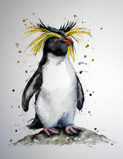
 Well I haven't managed to take a trip to the Falkland Islands to get some Rockhopper reference, but I did find a photo I took at London Zoo of their resident male, Ricky. I think these penguins are one of the most comical looking creatures on the planet. This guy has a haircut plucked straight out of the 80's. He reminds me of David Bowie in the film 'Labyrinth'! (If you haven't seen this fim already I highly recommend it!)I may have overdone the yellow head feathers a bit, but I think it adds even more character to this penguin. He was pretty easy to paint, but I spent an absolute age trying to get his beak correct. It's quite an unusual, razor-like beak with lots of grooves and angles. One of the reasons this image was so quick to execute is the monochrome colours. Although the blacks in my paintings are never pure black. Rockhopper feathers have a lovely blue sheen which I had to re-create with blue ink blobbed over the top of the black watercolour. The red eye stands out like a mini fire, so I used 'mars red' and a crisp highlight of white acrylic to make it shine.I am tempted to get this fella framed and entered in the SWLA exhibition in August. I think he would prove to be a popular and certainly an alternative looking addition!
 Once again it was an incredibly balmy DSWF exhibition at the Mall Galleries on Monday. I was incredibly excited, and felt honoured and chuffed to see my Amur Tiger painting hanging amongst such a wonderful collection of wildlife art. All the artists gathered at 3pm to hear the winners announced. Alas, we were told we would have to wait until 7:30pm!
The winner, Adam Binder seemed to be completely shell shocked up on the stage. It was interesting to see that a 3D work won, and he is certainly a worthy winner.
Even though I was not a prize winner, I was delighted to see a little red spot on my painting when I walked down the steps. It makes all the hard work worthwhile, and it is great to know that someone loves my work enough to invest in it. What is even more important, is that 50% of the proceeds from the sale of my painting will go towards the vital DSWF conservation projects.
The exhibition is available to view at the Mall Galleries until the 29th May, so if you haven't already I highly recommend a visit! More information can be found at: http://www.wildlifeartistoftheyear.orgNow I have to start thinking about creating a piece to enter in next year's competition, as entries are already being called for! I also aim to return to the Mall Galleries in August, and submit work to the SWLA open exhibition.